

Freedom From Anxiety
Responsive Web Design Case Study


Finding a Therapist is Already Hard Enough.
I Created a Website That Makes It Easier.
People seeking therapy want to find pertinent information about their prospective therapist and booking details without being overwhelmed.
My therapist client wanted to streamline her onboarding process for new patients and offer a way for patients to get resources they need to further their healing journey.
I interviewed five people who have been in therapy or currently seeking a therapist.
After completing an analysis of the qualitative data gathered through interviews, I used afftinity mapping to determine key insights into what was most important and found:
Users want enough information about the therapist and their practice to make a decision.
Users want to understand their insurance and payment implications.
Users want to progress to the next step in booking a session without having to send an email or make a phone call.
What’s Important for People Searching for Therapy?

Main Goals Include:
Exploring the bio and details about the therapist
Checking Insurance
Booking a consultation
Joining the mailing list
Downloading a worksheet
Getting resources from the blog or FAQ

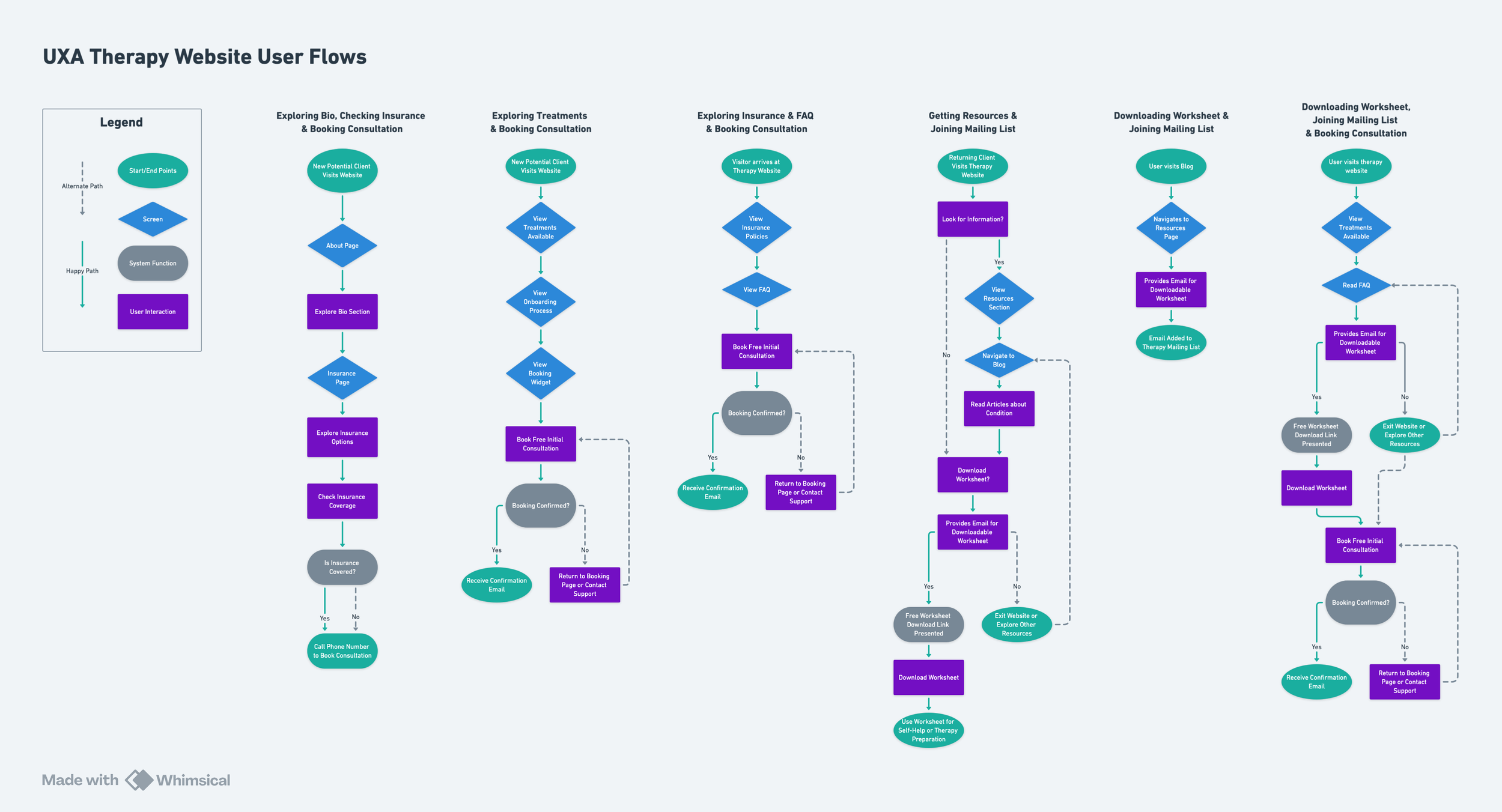
Accomplishing Target User Goals
Empathy is at the heart of my design thinking process so I used personas to imagine their desries.
I thought through what a successful pathway for a person evaluating a therapist would require in the form of screens, actions and outcomes.
These are the user flows I created with the various business aligned goals cited for each flow.
Low & Mid Fidelity Wireframing Made Design Choices More Clear
I used wireframing to ensure I was accurately representing what I learned during user research interviews and reflect the priorities of my client.
Wireframing helped me understand that I needed to simplify what was displayed on each page.
I eliminated the contact form at the bottom of each screen and moved the more in-depth treatment descriptions to a new page solely dedicated to treatments.


Crafting a brand
Warm, Coastal, Supportive, Calm & Affirming
My client emphasized that they liked neutral colors related to beach color palettes.
Their therapy practice is based in Santa Barbara, California so they wanted to keep the personality of the brand centered on a soothing energy inspired by the local landscape that would resonate and feel familiar to their clientele who live in the region.
High Fidelity Wireframes
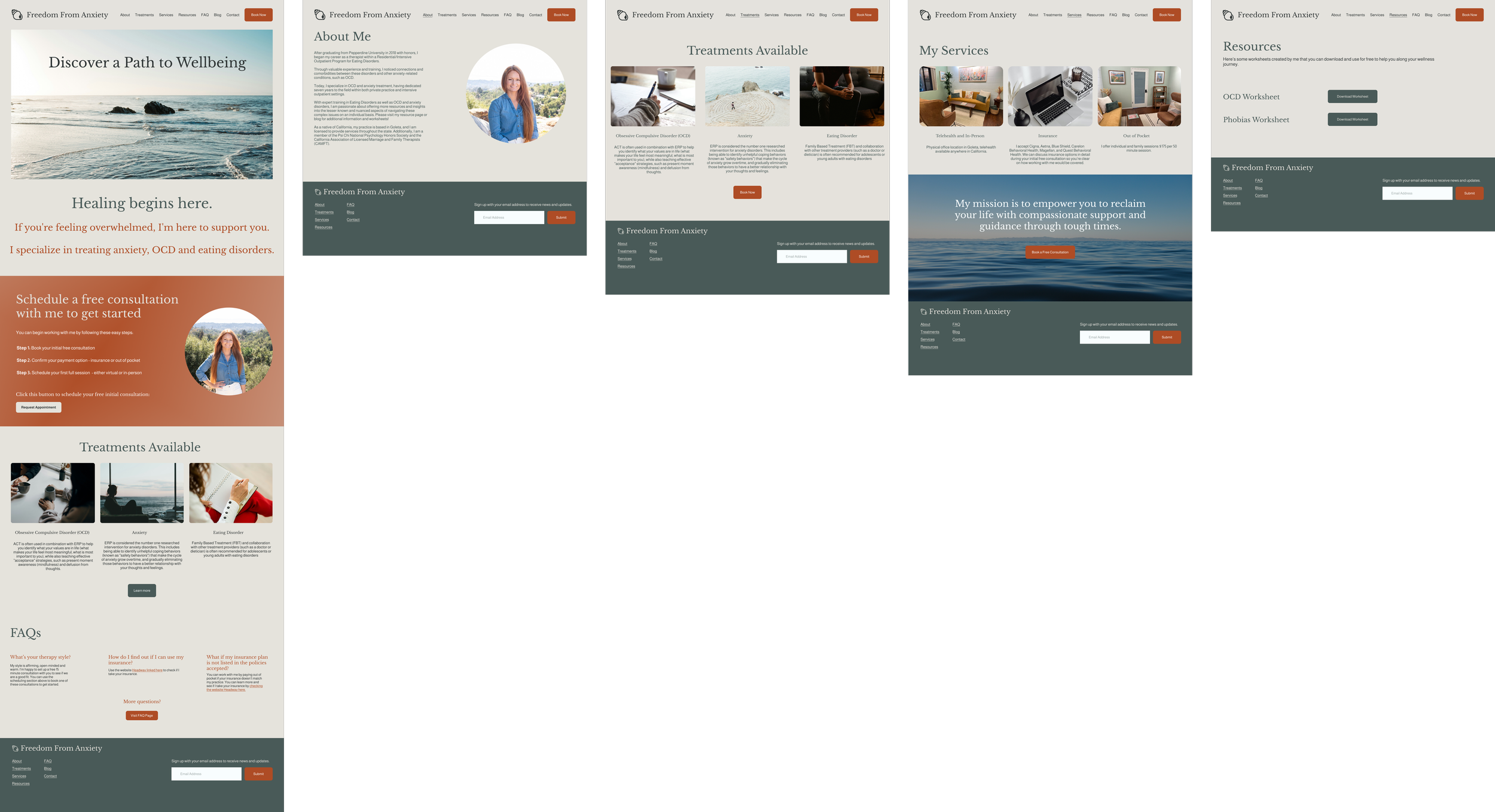
Freedom From Anxiety
Responsive Website
Key Impacts
Balance
Balancing client requirements with what’s been discovered through user research and insights outlined during synthesis demands clear communication, a willingness to be iterative and openness to new ideas.
Progressive Disclosure
Designing with progressive disclosure, showing the user only the most relevant information on each screen that’s needed to take action, was a great strategy .
I applied this thought process throughout this design as my research indicated the intended audience often feel overwhelmed with too many options and information.
Streamline Workflows
It’s always a win if I can integrate into tools that my client is already using so that I can save them time and simplify my client’s workflow through design.
In this case, I linked the new website with the software the already use to run their therapy practice and integrated an appointment widget that feeds right into their master calendar.
